

どうも、すんです。
例えばECサイト(ネットショップ)のデザインをするときに、「新商品」や「おすすめ!」など、商品にラベルや見出しをつけたくなることがあると思います。
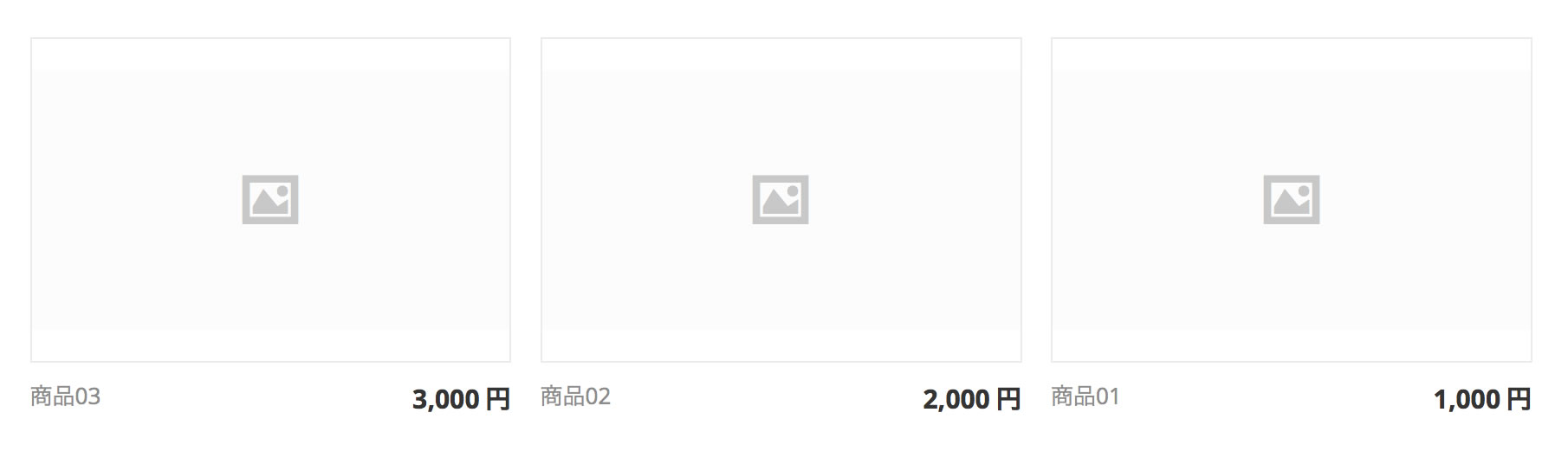
こんな感じのシンプルなデザインだと物足りないというか、ちょっとさびしいですよね。
でも、色々な種類のラベルをつけたいけど全種類画像にして切り出してサイトに当てるのもめんどくさいな〜なんて思ってしまったり…
今回は、そんな時にcssのみで簡単に実装できちゃうラベルデザインを紹介していきたいと思います。
三角形のラベル
/* 商品に見立てた枠 */
.triangle {
    background: #fafafa;
    width: 250px;
    height: 250px;
    border: #eee 1px solid;
    margin: 0 auto;
    position: relative;
}

/* ラベル部分 左上に表示 */
.triangle::before {
    content: "";
    top: 0;
    left: 0;
    border-bottom: 4em solid transparent;
    border-left: 4em solid #c12748; /* ラベルの色はここで変更 */
    position: absolute;
    z-index: 100;
}
.triangle::after {
    content: "New!";
    display: block;
    top: 5px;
    transform: rotate(-45deg);
    color: #fff; /* 文字色はここで変更 */
    left: 0;
    position: absolute;
    z-index: 101;
}
擬似要素before、afterを使用することで、cssのみで三角形のラベルを作ることができます。after部分のcontentの内容を変更することで、ラベル内の文字が変更されます。「New!」ではなく「おすすめ」とすることで、おすすめ商品の表示時にも使えますね。
※擬似要素を使用する要素に対しての「position: relative;」の記述を忘れずに!
上記では左上にラベルを表示させてみました。右上、左下、右下への実装方法は下記になります。
【右上】
/* ラベル部分 右上に表示 */
.triangle::before {
    content: "";
    top: 0;
    right: 0;
    border-bottom: 4em solid transparent;
    border-right: 4em solid #c12748; /* ラベルの色はここで変更 */
    position: absolute;
    z-index: 100;
}
.triangle::after {
    content: "New!";
    display: block;
    top: 5px;
    transform: rotate(45deg);
    color: #fff; /* 文字色はここで変更 */
    right: 0;
    position: absolute;
    z-index: 101;
}
【左下】
/* ラベル部分 左下に表示 */
.triangle::before {
    content: "";
    bottom: 0;
    left: 0;
    border-top: 4em solid transparent;
    border-left: 4em solid #c12748; /* ラベルの色はここで変更 */
    position: absolute;
    z-index: 100;
}
.triangle::after {
    content: "New!";
    display: block;
    bottom: 5px;
    transform: rotate(-135deg);
    color: #fff; /* 文字色はここで変更 */
    font-weight: bold;
    left: 0px;
    position: absolute;
    z-index: 101;
}
【右下】
/* ラベル部分 右下に表示 */
.triangle::before {
    content: "";
    bottom: 0;
    right: 0;
    border-top: 4em solid transparent;
    border-right: 4em solid #c12748; /* ラベルの色はここで変更 */
    position: absolute;
    z-index: 100;
}
.triangle::after {
    content: "New!";
    display: block;
    bottom: 5px;
    transform: rotate(135deg);
    color: #fff; /* 文字色はここで変更 */
    font-weight: bold;
    right: 0px;
    position: absolute;
    z-index: 101;
}
実際にサイトに当ててみた
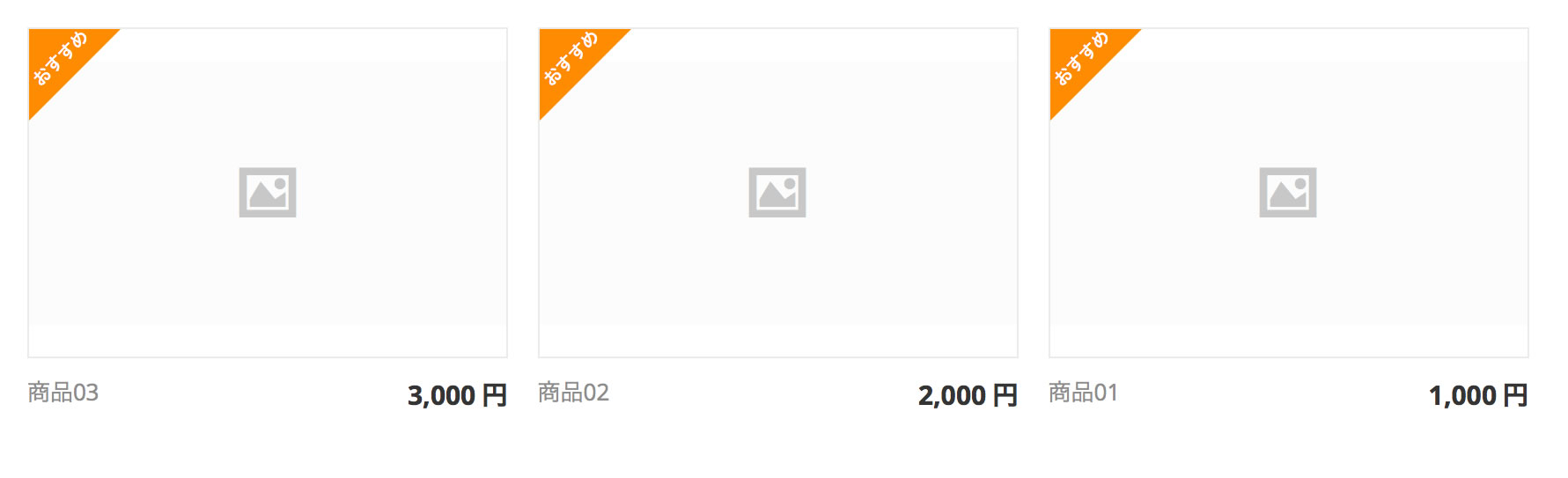
色を変えて、ラベルの文字を「おすすめ」にしてみました。
まとめ
例としてECサイト(ネットショップ)デザインでのラベルということで紹介しましたが、もちろん普通のコーポレートサイトやブログのデザインにも使えると思います。
ブログの記事に対して「新着」とか「人気」とか、ラベルがあるデザインもよく見かけますよね。
今回は「三角編」という形でくくりましたが、三角だけでなく、四角いラベルやリボン型のラベルなんかもCSSだけで作れちゃうんです。(すごいぞCSS)
それはまた次の機会に記事にしたいと思います。


